
Uraidla By Ben Goode
Have you ever been on a website that looked like an ad – the website colors, images, layout, and fonts just looked incredibly fake? Could it be the typography that affects its conversion?
I’m sure you clicked away pretty fast. It’s easy to pinpoint a well designed website from a poorly designed website, and your website visitors will recognize this.
More importantly than the pictures you place on your homepage, is the font you use on your website. In fact, fonts can increase conversions on your website! Don’t believe me?
Think about it. If a consumer is having trouble reading the information on your website, you can probably guarantee they won’t stay there that long.
That’s just one example. Let’s dive into the reasons font is impacting your website visits.
Okay, I lied. It’s not just typography that affects your website conversions, but a broader category of typeface that includes font.
Typeface incorporates other attributes that impact how your language is shown on your website.
This includes spacing of lines, words, and letters, which affects readability as well.
Certain spacing or lack of spacing, can make your reader feel overwhelmed which leads them to clicking away.
IT’S MORE THAN JUST FONTS

Fonts aren’t the end all be all. If you can’t read the font because all the letters are too squished together, it doesn’t matter what kind of font it is.
Here are a few things to keep in mind:
Line length – This is how long the text is between each margin on the left and right side of the page. When lines are too long or too short, this makes reading your content feel awkward.
This can also be affected depending on whether your content is on a desktop or mobile device, as the settings may change for the platform.
Leading – This is the amount of space between each line vertically, from baseline to baseline.
Increasing your leading can make it easier for the reader to read the text, and keep them more engage for longer as it doesn’t put as much strain on the eyes.
Kerning – Ever notice that space between each letter/character? Me neither! Usually this spacing tends to be innate, meaning the way it comes is usually suffice for most.
Although the spacing can be changed in order to improve a design.
Tracking – This is the spacing over a specific amount of letters and characters. Have a paragraph that looks like you packed too much wording into it?
Increase the tracking, trust me, your readers will thank you.
HOW DOES THIS LEAD TO CONVERSIONS?

It’s not about just looking pretty – picking a font gets down to the basics of psychology. Consumers want to follow brands they believe are trustworthy.
This may not always be consciously, but we buy products and services from brands that we believe will deliver.
We expect to receive that product and service in the way we intended when buying.
Just like we have judgements about a new person we meet, a candidate during an interview, or a partner on the first date, we have judgements about design.
If a font looks risky, we automatically associate the brand with this attribute as well. Our brain is fastly calculating the impression and trust from first encounters.
The font you’re using is an extension of this. Psychologically, there are fonts that keep consumers on your website longer and therefore increasing conversion.
Phil Renaud, a web designer, did his own experiment to test this out. Over his college career, he wrote 52 essays that ranged by 3 fonts.
His grades for these college essays varied depending on the font he used! Here were his results:
Times New Roman: A-
Trebuchet MS: B-
Georgia: A
Crazy, isn’t?! With an assignment like an essay, where they all pretty much look the same, font is still part of the impression.
Imagine all the websites your competing with!
EASY STEPS TO IMPROVE YOUR TYPOGRAPHY
If you’ve been cruising through this article thus far and just want a simple answer, it’s make your text readable.
The best way to present typography most effectively to keep consumers on your website is to make your text as readable as possible.
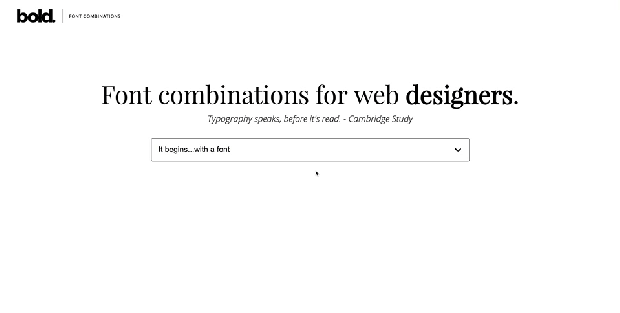
If you need help selecting a new font check out this font combination tool by Bold Web Design. Your typography is just a vehicle for consumers to get to the content of your website.
If the vehicle gets the job done and most effectively, then you’ll see the conversions.
Not sure where to start? Try using these steps.
1.Look over your headlines
Decluttering your headlines, can make them easier to read and in turn be more effective.
Your headlines should display information that’s most crucial and the reader shouldn’t miss.
Make sure your headlines are large, spaced out, and not too close to other text.
2. Change your font size
Our brain processes pictures 60,000 faster than text. Which means, anyway to process text faster, the better.
A quick tip? Increase your font size. Context is certainly key, but a bigger font size tends to be read faster.
3. Fix your line length
The ideal line length is approximately 50-60 characters. If you make your line too long, readers will have a hard time focusing.
Yet if you make it too narrow, the reader has to move back to another line very often, causing a discrepancy in the beat of the text.
HOW TYPOGRAPHY AFFECTS CONVERSIONS – FINAL THOUGHTS
We want your input – comment below!
- What font size does your website use?
- Which of these conversion suggestions do you believe could improve your website?
- What makes you click away from a website?


